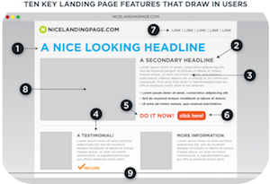
 So, you have worked tirelessly on your outstanding content and you have set up those social media calls to action, but you’re still not gaining the conversion rate you so desire. Why is that? It’s most likely because your landing page is not quite up to par yet.
Your landing page needs to fit with people’s expectations if you hope to capture their attention enough to download your content. If not, they will bounce back as fast as they bounced in.
There are some things you must consider if you hope to create amazing landing pages for your website. It takes some work, but it is well worth it.
We recently discovered a new marketing blog that we really admire. Matrix Internet Solutions has a lot of great posts about extraordinarily important marketing topics. The first one we read left us hooked! They wrote a pretty accurate list of what makes for a good landing page that we want to share with you readers.
“Keep It Simple & Relevant” People are minimalists, especially when it comes to websites. We want it simple, elegant, and easy to understand. If we have to spend to long trying to find the button, we tend to give up fairly quickly, right? Always keep your landing pages brief and straightforward. Irrelevant images are simply unnecessary. Don’t try to add in extra fluff in the hopes of making the page ‘pretty.’ Just keep it simple and relevant to your topic.
“Have An Attention Grabbing Headline” You want something that will draw a reader in. The headline should be eye-catchingly powerful—this is the first thing they will see and it should make a lasting impression. It is tricky to come up with a few words that will some up the entirety of your content, but once you get that done, it will work magic for you. It will definitely help to increase your conversion rate!
“Make Converting Easy” Here’s where it all goes down. This is where the conversions can be won or lost. It is absolutely imperative to make the path to your content clear and prominent. Seriously consider cutting out all unnecessary distractions. Make the converting process extremely easy and straight to the point.
“Keep It Mobile Friendly” People use their phones for everything these days, so make sure that your landing page is mobile friendly. No one wants to have to pinch and move the tiny screen around just to deal with your landing page. Eventually, they will give up on your CTA all together. You could even use two different landing pages for computers and mobile devices in order to track and compare the results.
“Always Test Your Page” Okay, now that everything is all set up and ready, it is time to put it to the test. You must try out your landing page if you hope to improve it! There are many different types of online tools that help with such tests. Regular testing and updates will definitely ensure the effectiveness of your page!

Recent Comments