 It’s been awhile since we’ve discussed website best practices. Let’s take today to dive into what we can do to set ourselves up for success from the very beginning.
Social Code asks a very important question in a recent blog, “Is your website hurting your conversion rate?” Well is it? Are your landing pages optimized towards conversions?
Here are a few things they suggest to do just that.
- “Your discounts and promotions appear at the top of your website” If you’ve got special offers and promo codes, make sure to shout it at the top of your lungs (digitally, of course). Showcase that at the top of your page clearly and prominently. If it is cheaper to buy online, for example, make sure that deal is known; otherwise, you’ll see a higher drop off in conversions.
- “You maintain a consistent design and color theme for call-to-action buttons” Your CTA buttons should all have the same look and feel to them throughout your website. That way users will come to expect a certain action with that theme. Use this same color scheme with your promo codes as well. Consistency is key!
- “Product landing pages tell you all you need to know” Don’t hide the most important information in paragraphs of fluff. Get to the point and make sure all the vital info is prominently placed. Emphasize what will be most relevant to your target market– ie) how your product/service will make their lives better or how you can save them money.
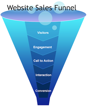
- “Your website pushes people down the funnel” Your website is not just about awareness. It’s about moving people through the sales funnel. Your checkout landing pages should be optimized for ease and speed. That means minimizing the hoops to jump through and the page load time. Make sure it is simple, quick, and painless for your users to convert.
- “You only ask for the information you need” This is so important. Don’t ask too many questions in your form fills. Seeing more than 2-3 fields to fill out severely deters people from filling it out. Users just don’t want to give you their life story just to get an eBook or learn more. Only ask for the absolutely essential information. Do you really need their phone number? Or will their email suffice? Usually, the answer is quite simple: no number required.
These are just five things to consider when designing (or redesigning) your website if you hope to convert at an efficient rate. Remember, all your marketing efforts are part of a whole journey– if one part falls short, the whole deal could come crumbling down. Make sure the optimize across the board, starting with your website and landing page experience.

Recent Comments